Ever since I was 10 years old, I've always had a personal space on the web to express myself. I was blogging since Wix was known as Freewebs, armed with rudimentary HTML/ CSS knowledge and an excessive amount of glitter graphics. Back then, Web 2.0 was starting to gain traction, HTML5 and CSS3 were starting to be introduced, and the most popular browser was Internet Explorer. Nowadays, I'm jealous of the newfangled techniques that make web design easier, some of which I'll be discussing later in this post.
Over a decade later, I decided to take up the personal website game again, with considerably less glitter. The reasons for this was numerous - to document my journey in studying software engineering, write about my myriad of interests, experiment with designing website layouts to my heart's content, and express myself.
The title of this blog - "Commonplace Book" - refers to the concept of keeping a notebook to collect information. Similarly, this blog will serve as a collection of interesting information as I come across it. I wanted it to be the ultimate place for me to post about all of my interests.
The Brainstorming
What was my blog going to look like? What was I going to blog about?
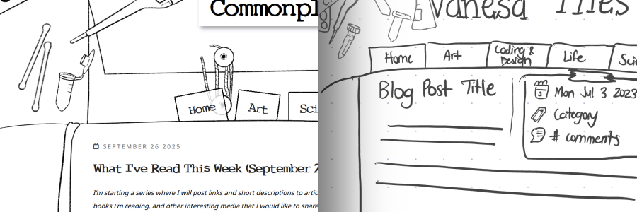
The process of deciding how I want a website to look has changed very little from when I was young. I sketch out multiple concepts. Here is the original concept I first drew in Notability:

I still wasn’t sure what I wanted to call my blog yet, so a temporary title, “Vanesa Files”, was up there. I was still able to keep the original feel of the layout with different sections - “life” became “misc” and “coding and design” was shortened to just “tech”. As you can see, a lot of the same concepts made it onto the actual website.
A few months after having drawn the actual idea, I finally got to work on making it.
Creating the Layout
Next, I gathered reference images for items I wanted per section. This included reference images online, screenshots, and photos of my own items.

Each header is 1920px wide and 600px wide and I drew and/or traced everything using Procreate on my iPad with an Apple Pencil using the Sketch Brush from the Soft Anime Procreate Set by Di. I drew each item on its own layer, then decided on its placement and rotation afterward. Ah, the beauty of digital art!

Coding the Layout
I often code a simple HTML page with the bare minimum content I would have first so I could focus on the CSS, which I then fit into a template I coded for the CMS I used. Firefox development tools is my current MVP.
The code itself is mostly relatively straightforward, although the journal background that holds the main content is a bit special. To get the responsive look and feel of the journal background that has the main content, I use a special CSS property:
border-image
.
border-image allows one to use an image as a border around the content, and it doesn’t seem to be used very often. Essentially, one can ‘slice’ a source image using border-image-slice by defining the offset from the top, right, bottom, and left sides. The width of the image to use border-image-width. From there, border-image-repeat can be used to either repeat (tile) or stretch the image.
I use a combination of border-image-slice and border-image-width values to define each of the four borders and scale it so that it always surrounds the content. The border-image generator on MDN docs came in handy. I then added padding to further adjust the child elements inside the text. The result is the feel of a notebook that scales with the content, as you can see on this page.

Honestly, I think border-image should be used more often! The same assets can be used to convey different results. It’s also fantastic for being responsive to the content inside of it. I recommend reading Revisiting CSS border-image by Andy Clarke to see more examples of its potential.
Setting Up the Blog CMS
This blog is powered by simple the simple flat file CMS, Grav. Although I have previous experience using Wordpress and other database-based content management systems, I wanted something simple that worked out of the box.
Installing Grav was as simple as unzipping a folder onto my main website. For even easier use, I installed the Admin panel with it, although Grav doesn’t require it.
Creating my own theme for Grav was also straightforward – all I had to do was follow the Theme Tutorial. I based it on the pure-blank tutorial, although I didn’t end up using the Pure.css framework, opting instead to create my own CSS grid system.
Themes are based on Twig, a PHP-based template system. All of the main PHP overhead is stripped down to variables and expressions wrapped in curly bracket tags { }.
I followed the “Build a Blog” tutorial in the Grav documentation to make a blog - rather, blogs. The “science”, “tech”, and “misc” pages are all top-level “blogs” in themselves, which is how I can categorize each section. Each blog entry is a child item, so to ensure each child inherits the CSS unique to its section, I included this line of code in the base.html.twig:
<body class="{{ page.header.body_classes|e }} page-{{ uri.paths[0]|e }}">uri.paths returns an array of the folder structure of a page – for example, if the page had the path blog/foo/bar, the array would return blog, foo, bar. By selecting only the first element (the |e means evaluate the expression), the class will always be one of the top-level pages I’ve defined.
To make the homepage display all of the blog posts together, I use advanced collection logic. The homepage’s header/frontmatter looks like this:
---
title: Home
body_classes: page-home
content:
    items:
        - '@page.children': '/science'
        - '@page.children': '/tech'
        - '@page.children': '/misc'
    order:
        by: date
        dir: desc
    limit: 5
    pagination: true

---
Multiple collections can be referenced under “items” in “content”. Here, I am looking for all of the children of the “science”, “tech”, and “misc” sections. The collection itself can be customized with other properties as shown here, such as order, limit, and pagination.
The way I had described is actually a bit more cumbersome than simply making the top-level domain a blog in itself and taking advantage of page taxonomy. The reason I did it this way was mostly a preference for folder structure to organize the website and leave room for flexibility on this website, but I don’t necessarily recommend it for others.
Conclusions and Reflections
I’ve only scratched the surface of the potential of Grav CMS – there are numerous plugins and template features I have yet to explore. As someone used to the complexities of Wordpress, Grav has been refreshingly simple. However, simplicity doesn’t mean Grav lacks functionality.
When I first started coding websites, I was a child who learned HTML from Neopets.com. As a child, I didn’t know what I was doing, but I wanted to make something. The creative potential of children is powerful in itself because the stakes are low and the motivation is high. A child isn’t comparing themselves to the experts of a particular craft, worried about deadlines, and striving for perfectionism; they are simply focused on creating.
I made a lot of bad websites. However, through sheer persistence, I naturally improved.

This was the last layout I had made for my old personal website, Chosen Destinies, before I had stopped updating it. The ‘items strewn on desk’ aesthetic is something I still used. The sticky note that says “to do: live instead of exist” is referenced in the “Tech” section of my header.
As an adult burdened with the knowledge of the elements of design and the intimidating amount of web frameworks that exist out there, I wanted to make something that showcased all of my talents. Starting became a monumental task.
However, as I’ve learned over time, perfectionism is the enemy of having something done. I went back to the wisdom of childhood and simply created. After all, I can always improve it later.
So after a few weeks, I went from some notes in Notability to the blog you see today. It’s not perfect. I could optimize a few more things. But it’s here. Hooray! Expect to see more posts documenting the journey through the things I’ve learned.